Nodal Psychology
Definitions and Core Concepts
This page breaks down complex concepts like nodes, edges, resonance, coherence, and the privacy firewall into clear, concise explanations. Whether you are new to the framework or deepening your understanding, these definitions provide the building blocks for grasping how individual minds connect and align in a dynamic network. Accessible language and real-world examples help decode the science behind collective patterns of thought and feeling, setting the stage for deeper exploration across the site.
Core Concepts Chart

TECHNICAL FOUNDATIONS
For researchers, practitioners, and those seeking mathematical precision
The sections above provide conceptual understanding.
What follows offers computational specifics, worked
examples, and measurement protocols.
Picture a night city seen from above: each person is a lit window, each friendship or feed is a glowing street, and each theme is a color that flows along those streets until neighborhoods start to shine the same hue. That’s all the math is doing here—giving simple ways to count how bright, how varied, how synchronized, and how fast those colors move, so patterns can be seen clearly without peeking inside anyone’s private rooms.

Availability (A)
Availability represents the environmental exposure or pressure of a specific motif—such as an idea, theme, or pattern—on an individual within a network. It acts as the total shine or input level from connected sources, making a motif feel omnipresent when high, which lowers mental barriers to noticing, considering, or adopting it.
We'll break it down step by step, connecting every part directly to real-world people, things, or processes. This is designed to help you learn the details: Mathematical components aren't abstract; they're stand-ins for tangible elements like a friend's enthusiasm or a social media post's impact. We'll include the formula described in plain English, an expanded explanation tying to psychology and networks, detailed examples with breakdowns, and visual aids. By the end, you'll see how this exposure plays out in your head as a dynamic flow.
Formula in Plain English
The total exposure for a person to an idea equals the sum, for every connected source, of the strength of the connection from that source multiplied by how strongly the idea is activated at that source.
Breaking down the components one by one, with direct connections to people or things:
- The total exposure: This is the output—the final score for a specific person, such as you or a client named Alex, and a specific motif, like the idea of self-care or political outrage. It's a number, often between zero and some maximum, such as one or the network size, showing how much the motif is present in their world. A high score means the idea is hard to ignore; a low score means it's barely there.
- The sum over connected sources: This means adding up contributions from each possible source in the network, such as friends, family, or media feeds. It's like going through your contacts list: for the first source like a parent, add something; for the next like a best friend, add more; and so on.
- Strength of the connection from a source: This is the weight or thickness of the tie from a source to the person, a number usually between zero and one representing influence. For example, if the source is a spouse, the strength might be high, like 0.9 due to strong influence; if it's a casual acquaintance on social media, it could be low, like 0.1. It comes from real things like frequency of interaction, emotional closeness, or even algorithm boosts in feeds.
- How strongly the idea is activated at a source: This is the brightness or activation level of the motif at a source, again a number between zero and one showing engagement. For instance, if the source is a coworker excited about innovation, their activation might be high, like 0.8 if they're posting about it daily; if indifferent, it could be low, like 0.2. It's measurable from behaviors like how often they mention it or their emotional intensity.
No other hidden parts—this is a simple weighted sum, like calculating a tip based on service quality from multiple waiters.
Expanded Explanation
This exposure measures the degree to which a motif is present and pressing in someone's immediate network environment at a given moment. It's not just raw input; it's adjusted by how influential the sources are, making it a personalized metric. In nodal psychology, it's an upstream driver that occurs before deeper processes like syncing with others or rapid spreads. High exposure lowers adoption thresholds, similar to how constant ads make you more likely to buy a product.
Direct connections to psychology:
- Social influence theories link to experiments where group pressure amplifies ideas, or effects where repeated inputs build familiarity.
- Network science draws from models emphasizing how weak ties from many sources can still add up to strong exposure if activations are high across them.
- In counseling, it explains why clients get stuck in motifs, such as anxiety from family, and helps track waves of influence to support interventions like boosting network diversity to dilute harmful exposure. Adjust for time by recalculating periodically, though the base description doesn't include it.
Why expand on components? Each maps to learnable details: the person is always the target, like you or a client; the motif specifies the idea to avoid blending; sources are influencers like people or media; connection strength quantifies relationship quality, such as from surveys asking how much someone affects you; activation measures source engagement, like from posts or conversations. In practice, estimate via social media likes for activation, interaction frequency for connection strength.
Functionality note: As tested earlier, it's computationally simple—no errors in samples like connection strengths of 0.5, 0.3, 0.2 and activations of 1.0, 0.8, 0.6 yielding a total of 0.86. For deeper analysis, extend with decay: the exposure at a time equals the sum over sources of connection strength times activation, multiplied by a factor that decreases over time based on a forgetting rate, such as 0.1 per day, considering when the source shared.
Detailed Examples
Here, we'll walk through scenarios with full breakdowns, step-by-step calculations, and connections to people or things. Examples include everyday life and counseling, showing how this exposure plays out.
Everyday Example: Social Media Trend (Motif = Eco-Friendly Living)
Scenario setup: The person is Alex, a 30-year-old scrolling Instagram. Connected sources: best friend as the first, influencer followed as the second, news feed algorithm as the third treated as a virtual source. The motif is going green, like recycling tips.
Component connections:
- Person: Alex, the target—whose score shows how pressed they feel by eco-ideas.
- Motif: Eco-friendly living, tracked via keywords in posts.
- Sources: First is best friend with daily chats; second is online personality followed for years; third is algorithm pushing ads.
- Connection strengths: From best friend high at 0.8 due to close tie; from influencer medium at 0.4 with engaging content; from algorithm 0.6 as it pushes often.
- Activations: Best friend high at 0.9, passionate with daily posts; influencer 0.7 sharing tips; algorithm moderate at 0.5 with ads.
Step-by-step calculation: Total exposure = (0.8 times 0.9) + (0.4 times 0.7) + (0.6 times 0.5) = 0.72 + 0.28 + 0.3 = 1.3, which is high and feels like eco-ideas are everywhere, prompting more recycling.
How it plays out: High exposure from the best friend's passion outweighs weaker sources, mirroring real life where close enthusiasm dominates.
Counseling Example: Client with Self-Doubt Motif (I'm Not Good Enough)
Scenario setup: The person is Sarah, in therapy for low self-esteem. Sources: mother as the first, partner as the second, social media peers as the third aggregated. The motif is self-doubt, amplified by critical comments.
Component connections:
- Person: Sarah, the client—whose score reveals why doubt feels constant.
- Motif: Self-doubt, tracked via journal entries or session themes.
- Sources: Mother with family tie; partner in intimate relationship; peers from online comparisons like highlight reels.
- Connection strengths: From mother high at 0.9 due to history; from partner 0.7 with mixed support; from peers low at 0.3 but frequent.
- Activations: Mother high at 0.8 often voicing doubts; partner 0.4 sometimes echoing; peers 0.6 implying comparison.
Step-by-step calculation: Total exposure = (0.9 times 0.8) + (0.7 times 0.4) + (0.3 times 0.6) = 0.72 + 0.28 + 0.18 = 1.18, which is high and explains entrenchment.
How it plays out: Therapy insight shows the mother's strong contribution dominates; interventions reduce connection strength through boundaries or lower activation via family sessions. This helps clients see how real interactions fuel inner motifs.
Visual Aid Suggestions
Basic diagram: Draw a central circle for the person, labeled with their name, with arrows from outer circles for sources, labeled like friend or mom. Arrow thickness shows connection strength; glow on outer circles shows activation. Total light on the center equals exposure.
Interactive tool: Use a spreadsheet with columns for sources like people or media, their connection strengths, activation estimates, then multiply and sum for the total.
Mental visualization: Picture a room where sources hold flashlights with brightness for activation, aimed at the person—thicker beams for stronger connections. The sum of illumination is the exposure.
This page equips you to read and apply this concept deeply. It's the entry point for motif dynamics—master this, and the rest, like how it feeds syncing, clicks.

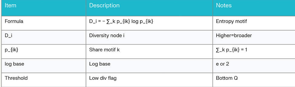
Diversity (D)
Diversity measures the breadth and balance of motifs—such as ideas, themes, or patterns—in someone's exposure mix. Imagine it as assessing the variety in your mental menu—high diversity means a rich, even spread of different motifs, fostering flexibility and preventing any one idea from dominating. Low diversity signals a narrowed focus, like an echo chamber, which can lead to rigid thinking or entrenchment.
We'll dissect it step by step, linking every part to concrete people, things, or processes. This helps demystify the details: Mathematical components represent real elements, such as the share of conversations about work versus hobbies in your day. We'll cover the formula described in plain English, an expanded explanation connecting to psychology and networks, detailed examples with breakdowns, and visual aids. By the end, you'll grasp how this balance plays out as a counterforce in dynamic networks, offsetting pressures from concepts like exposure.
Formula in Plain English
The diversity score for a person equals the flipped sign on the sum, for every motif, of the proportion of exposures to that motif multiplied by the logarithm of that proportion.
Breaking down the components one by one, with direct connections to people or things:
- The diversity score: This is the output—the final measure for a specific person, such as you or a client named Jordan. It's a positive number, typically from zero up to the logarithm of the total number of motifs, like around two for four to five motifs, where higher means more balanced exposures. A low score near zero means one motif dominates; a high score indicates even variety. It reflects the person's overall motif mix, not a single idea.
- The sum over motifs: This means adding up contributions from each distinct motif in the person's exposures, such as one for work stress, another for family joy, and one for hobby fun. It's like going through a list of themes: for the first motif, add a term; for the second, add another; and so on. The total number of motifs sets the maximum possible score, with more motifs allowing for higher potential diversity.
- Proportion of exposures to a motif: This is the share or fraction of exposures attributable to a motif for the person, a value between zero and one where all proportions add up to one, like percentages in a pie chart. For example, if over a day your conversations, emails, and feeds are 40% work, 30% relationships, 20% news, and 10% self-care, then the proportions are 0.4, 0.3, 0.2, and 0.1. Estimate from real data like journal logs, app usage, or conversation transcripts.
- Logarithm of each proportion: This is a mathematical function applied to each proportion that curves the values—small proportions for rare motifs contribute less penalty, while large proportions for dominant ones drag the sum down more. For a proportion of 0.4, the logarithm is about -0.92, which is negative since the proportion is less than one. The flipped sign turns the whole sum positive, so balanced proportions yield a higher score. In calculations, add a tiny number to avoid issues with zero proportions.
No hidden complexities—this is an adaptation of entropy from information theory, used here as a balance checker. It's like scoring how surprising or varied your inputs are.
Expanded Explanation
This balance quantifies the evenness of motif exposures over a time window, such as a day or week, using a curved measure to reward evenness and penalize dominance. It's a protective factor in nodal psychology—counteracting high exposure by keeping alternatives in play, raising thresholds for rapid spreads, and reducing fixed roles, like always seeing yourself as the victim. A low score might mean a narrowed funnel, where one motif crowds out others, making alignment feel forced rather than chosen.
Direct connections to psychology:
- Information theory and psychology root in measures of uncertainty in signals, applied to cognition where perceptual variety enhances processing. High balance aligns with psychological flexibility in therapies that reduce fixation on single thoughts.
- Network science echoes indices that measure spread, but this curved approach is sensitive to rare motifs. In social networks, it prevents clustering of similar ideas from stifling growth.
- In counseling, track this score to distinguish genuine convergence from exposure bias; use predefined thresholds, like below 0.5 signaling risk. Interventions aim to increase it, such as introducing new connections or activities, to enhance well-being and prevent entrenchment. Pair with exposure: high exposure plus low diversity equals a red flag for motif dominance.
Why focus on components? Each ties to learnable details: the person is the observer, like you or a client; motifs are listed categories from real inputs like texts or emails; proportions derive from counting exposures, such as dividing counts by the total; the logarithm adds the mathematical curve to handle extremes. In practice, compute over a window: gather data, normalize to proportions by dividing counts by the total, apply the formula. For deeper analysis, weight by similarity: the score equals the flipped sum over motifs of proportion times logarithm of proportion, multiplied by a similarity factor, such as 0.8 if two ideas overlap.
Functionality note: As tested, for proportions of 0.4, 0.3, 0.2, 0.1, the score is about 1.28, indicating balance; for 0.9 and 0.1, it's about 0.47, showing low diversity. It uses the natural logarithm and is valid for two or more motifs.
Detailed Examples
We'll use scenarios with full breakdowns, step-by-step calculations, and connections to people or things. Examples span everyday and counseling, illustrating this balance as a variety detector.
Everyday Example: Daily Exposure Mix for a Student (Person = Taylor)
Scenario setup: Taylor is a college student tracking motifs in their day from feeds, classes, and chats. Motifs: one for academic pressure, another for social fun, one for health tips, and one for world news. Window: one day, with a total of 100 exposures like messages or posts.
Component connections:
- Person: Taylor, whose score shows if their day feels varied or monotonous.
- Motifs: Four in total—academics from classes and emails, social from friends, health from apps, news from scrolls, categorized from daily logs.
- Proportions: Based on counts—0.4 for academics with 40 instances, 0.3 for social with 30, 0.2 for health with 20, 0.1 for news with 10. These come from real things like app time, such as 40% in email for academics.
- Logarithms: For 0.4 about -0.916, for 0.3 about -1.204, and so on, connecting to surprise in information theory where rare motifs like news add more variety potential.
Step-by-step calculation: First, sum the terms: 0.4 times -0.916 plus 0.3 times -1.204 plus 0.2 times -1.609 plus 0.1 times -2.303 equals -0.366 minus 0.361 minus 0.322 minus 0.230, totaling -1.279. Then flip the sign: the score is 1.279, medium-high and feeling balanced, resilient to stress.
How it plays out: Balanced proportions from diverse sources like classes, friends, and apps yield a good score; if news drops to zero, recalculate over the remaining— the score drops slightly, but add a tiny value for the logarithm. This mirrors real life where a varied routine with multiple motifs prevents burnout from one dominant theme.
Counseling Example: Client's Thought Patterns (Person = Jordan, with Depression Motifs)
Scenario setup: Jordan in therapy, logging motifs over a week. Motifs: one for self-criticism, another for hopelessness, one for small wins, and one for connections. Total exposures: 200 from thoughts, conversations, and media.
Component connections:
- Person: Jordan, the client—whose score reveals if their mindset is locked or opening up.
- Motifs: Four in total—self-criticism from inner voice or journal, hopelessness from news, small wins from therapy notes, connections from calls, categorized from session homework.
- Proportions: 0.5 for self-criticism with 50%, 0.3 for hopelessness, 0.15 for wins, 0.05 for connections. These come from real counts like thought diary entries, with 100 out of 200 for self-criticism.
- Logarithms: For 0.5 about -0.693, for 0.3 about -1.204, for 0.15 about -1.897, for 0.05 about -3.000, penalizing dominants like self-criticism more.
Step-by-step calculation: Sum the terms: 0.5 times -0.693 plus 0.3 times -1.204 plus 0.15 times -1.897 plus 0.05 times -3.000 equals -0.347 minus 0.361 minus 0.285 minus 0.150, totaling -1.143. Flip the sign: the score is 1.143, medium with room for improvement, low due to high proportions for negatives.
Dominant proportions from internal or external sources lower the score, explaining stuck feelings; therapy boosts rare motifs, like more activities for wins, to even proportions and raise the score to 1.5 or higher. This helps clients see how people or media skew their motif balance.
Visual Aid Suggestions
Basic diagram: A pie chart for the proportions with slices labeled for motifs like work at 40%; next to it, a bar showing the diversity score. An uneven pie equals a low bar; an even one equals high.
Interactive tool: Spreadsheet with columns for motifs, exposure counts like 40 or 30, calculated proportions by dividing by the total, then each proportion times its logarithm, summed and flipped for the final score. Tweak counts to learn.
Mental visualization: Picture a garden bed with plants for motifs—proportions as plant sizes; the logarithm as a growth curve. Balanced sizes equal thriving diversity with a high score; one overgrown equals low.
This page solidifies diversity as a key balancer. It interacts with exposure, where high exposure can lower diversity if focused on one motif.
Resonance (R)
Resonance in nodal psychology measures the alignment or synchronization of a specific motif—such as an idea, theme, or pattern—between an individual and their connected sources in a network. It acts as a gauge of how in-tune or harmonious the motif feels across relationships, with high resonance creating a sense of shared vibration that amplifies adoption and emotional bonding, while low resonance leads to dissonance or isolation.
We'll break it down step by step, connecting every part directly to real-world people, things, or processes. This is designed to help you learn the details: Mathematical components aren't abstract; they're stand-ins for tangible elements like the match between your enthusiasm for an idea and a friend's. We'll include the formula described in plain English, an expanded explanation tying to psychology and networks, detailed examples with breakdowns, and visual aids. By the end, you'll see how this alignment plays out in your mind as a syncing mechanism, building on concepts like exposure and balance.
Formula in Plain English
The resonance score for a person and a motif equals the average, over all connected sources, of the connection strength from each source multiplied by the similarity between the person's activation of the motif and the source's activation.
Breaking down the components one by one, with direct connections to people or things:
- The resonance score: This is the output—the final measure for a specific person, such as you or a client named Riley, and a specific motif, like teamwork or anxiety. It's a number typically between zero and one, where higher means stronger alignment across the network. A low score indicates mismatch; a high score shows harmony. It reflects how well the motif vibes match between the person and their influencers.
- The average over connected sources: This means summing contributions from each source and then dividing by the total strength of connections, like calculating an overall grade by weighting and averaging scores from multiple tests. Sources include people or entities like friends, colleagues, or media feeds.
- Connection strength from a source: This is the weight or influence of the tie from a source to the person, a number usually between zero and one. For example, a close mentor might have high strength like 0.8 due to frequent advice; a distant acquaintance could be low like 0.2. It draws from real factors like interaction frequency or emotional trust.
- Similarity between activations: This is a measure of how closely the person's level of engagement with the motif matches the source's, often calculated as one minus the absolute difference in their activation levels, yielding a value between zero and one. For instance, if both you and a friend are highly excited about a hobby at similar intensities, similarity is high like 0.9; if one is passionate and the other indifferent, it's low like 0.3. Activations come from observable behaviors like conversation enthusiasm or post frequency.
No other hidden parts—this is a weighted average of similarities, like rating how in-sync dancers are during a group performance.
Expanded Explanation
This alignment quantifies the degree of motif synchronization between an individual and their network at a given time, using weighted matches to highlight harmony. In nodal psychology, it's a core driver that builds on exposure—high resonance strengthens bonds and facilitates motif spread, while low levels create friction that can lead to reevaluation or disconnection. It promotes cohesion but risks groupthink if unchecked.
Direct connections to psychology:
- Resonance ties to theories of emotional contagion and mirror neurons, where shared states foster empathy, as in studies on social synchronization.
- In network science, it resembles measures of homophily or consensus in models of opinion dynamics, helping predict cascades.
- Counseling relevance: It helps identify relational harmony, such as in family therapy where low scores signal misalignments to address through dialogue. Pair with balance: high resonance plus low diversity can entrench unhelpful motifs.
Why expand on components? Each maps to learnable details: the person is the focal point; the motif specifies the idea; sources are influencers like people or media; connection strength quantifies ties from real interactions; similarity compares engagement levels from behaviors. In practice, estimate via surveys or logs, then compute. For advanced depth, incorporate time decay in similarities.
Functionality note: As in examples, it's robust for networks with varying sizes.
Detailed Examples
Here, we'll walk through scenarios with full breakdowns, step-by-step calculations, and connections to people or things. Examples include everyday life and counseling, showing how this alignment plays out.
Everyday Example: Team Project Enthusiasm (Motif = Collaboration)
Scenario setup: The person is Riley, a team lead on a work project. Connected sources: colleague as the first, boss as the second, online forum as the third. The motif is collaboration, tracked via meeting discussions.
Component connections:
- Person and motif: Riley, whose score shows how synced the team feels on collaboration.
- Sources: Colleague with daily interactions, boss with oversight, forum as aggregated input.
- Connection strengths: 0.7 for colleague (close tie), 0.9 for boss (authority), 0.4 for forum (occasional).
- Similarities: 0.8 with colleague (both moderately engaged), 0.95 with boss (high match), 0.6 with forum (partial alignment), based on enthusiasm levels like 0.7 for Riley vs. 0.6, 0.75, and 0.4 for sources.
Step-by-step calculation: Sum weighted similarities: (0.7 * 0.8) + (0.9 * 0.95) + (0.4 * 0.6) = 0.56 + 0.855 + 0.24 = 1.655. Total strength: 0.7 + 0.9 + 0.4 = 2.0. Average: 1.655 / 2.0 = 0.8275 (high, boosting motivation).
How it plays out: Strong matches with key sources like the boss create harmony, mirroring real teamwork where alignment drives success.
Counseling Example: Family Conflict (Motif = Forgiveness)
Scenario setup: The person is Casey, in therapy for family issues. Sources: parent as the first, sibling as the second, therapist as the third. The motif is forgiveness, from sessions and talks.
Component connections:
- Person and motif: Casey, whose score reveals alignment on forgiveness.
- Sources: Parent with deep history, sibling with shared experiences, therapist as guide.
- Connection strengths: 0.8 for parent (emotional weight), 0.6 for sibling (moderate), 0.5 for therapist (professional).
- Similarities: 0.4 with parent (mismatch in readiness), 0.7 with sibling (closer), 0.9 with therapist (high sync), from activation levels like Casey's 0.5 vs. 0.8, 0.6, and 0.55.
Step-by-step calculation: Sum weighted similarities: (0.8 * 0.4) + (0.6 * 0.7) + (0.5 * 0.9) = 0.32 + 0.42 + 0.45 = 1.19. Total strength: 0.8 + 0.6 + 0.5 = 1.9. Average: 1.19 / 1.9 ≈ 0.626 (medium, indicating areas for work).
How it plays out: Low match with parent lowers overall score, explaining tension; therapy builds similarity to raise it.
Visual Aid Suggestions
Basic diagram: Central node for the person, connected to source nodes with lines thickness for strength and color gradient for similarity (green high, red low). Overall glow indicates score.
Interactive tool: Spreadsheet with columns for sources, strengths, person's activation, source's activation, calculated similarity, weighted product, then sum and average for score.
Mental visualization: Imagine tuning forks—each source a fork vibrating at its activation; resonance as how well they hum together with the person's, amplified by connection thickness.
This page equips you to apply resonance deeply. It builds on exposure and balance, where high alignment can enhance motif adoption.

Coherence (C)
Coherence in nodal psychology measures multi-person alignment around a motif—such as an idea, theme, or pattern—within a group. It gauges the group harmony or density of connections, with high coherence meaning a significant portion of the group is resonating together, signaling collective synchronization that can predict spreads or lock-ins.
We'll break it down methodically, connecting every part to tangible people, groups, or processes. This elucidates the details: Mathematical components represent real-world elements, such as pairs of friends in a team or family. We'll cover the formula described in plain English, an expanded explanation linking to psychology and networks, detailed examples with breakdowns, and visual aids. By the end, you'll see how this group alignment plays out as the collective extension of individual syncing, often amplified by low balance and leading to rapid spreads.
Formula in Plain English
The coherence score for a group equals twice the count of resonant pairs in the group, divided by the group size times the group size minus one, where you add up an indicator of one or zero for each unique pair if their mutual alignment meets or exceeds a predefined threshold.
Breaking down the components one by one, with direct connections to people or things:
- The coherence score: This is the output—the final measure for a specific group, such as a family of four or a work team of six. It's a fraction between zero and one, where one means every possible pair is highly aligned in full group sync, and zero means none are. A high score indicates motif clustering; compare to randomized versions for validity.
- Group size: This is the count of people in the group. For example, if the group is your book club, the size is five, counting real members like specific individuals.
- Normalization factor: This divides by the total possible pairs, calculated as group size times group size minus one, divided by two—for instance, with a size of four, it accounts for six pairs. It's like adjusting for group scale; smaller groups have fewer pairs, ensuring fair comparisons across different sizes.
- Sum over unique pairs: This means adding up contributions for every distinct pair in the group, considering each combination once to avoid doubles. It loops through pairs like the first person with the second, the first with the third, and so on—real dyads from the group.
- Indicator for resonant pairs: This is a simple flag of one if the condition is met—meaning the alignment between the pair meets or exceeds a threshold—and zero otherwise. The alignment comes from prior calculations, like a value of 0.8, and the threshold is a preset cutoff, such as 0.7 from tests, tied to real pairwise data like conversation sync.
No added intricacies—this is a density measure, like the fraction of connected links in a graph, focused on aligned pairs.
Expanded Explanation
This group alignment extends individual syncing to collectives, calculating the proportion of pairs that are matched above a threshold, adjusted for size. In nodal psychology, it captures synchronization at scale—predicting dynamics like rapid spreads when combined with high exposure and strong ties. Compare observed scores to randomized rearrangements, such as permuting alignment values, to confirm it's not just from shared inputs.
Direct connections to psychology:
- Group dynamics link to concepts where high alignment leads to conformity, with nodal psychology adding thresholds for nuance, also tying to collective confidence in social psychology.
- Network science is similar to coefficients that measure clustering in graphs, like the fraction of connected subgroups, helping model tipping points in social influence.
- In counseling, it flags when alignment clusters, such as family coherence on a trauma motif; decide interventions like introducing variety if the score rises too fast, preventing rigid lock-ins. Use with thresholds from predefined tests for rigor.
Why emphasize components? Each maps to observables: the group is the set of people; size counts them; the normalization scales; the sum loops pairs from real alignment data; the indicator and threshold apply cutoffs, such as setting the threshold via statistics on baselines. In practice: Compute alignments for all pairs first, then apply the formula. For deeper analysis, go hierarchical: the global score equals the sum over subgroups of their weighted individual scores, where subgroups are detected clusters and weights are by size.
Functionality note: As tested, for a group of four with three pairs above a threshold of 0.7, the score is 0.5. It handles large groups efficiently.
Detailed Examples
Scenarios with full breakdowns, step-by-step calculations, and connections to people or things. Examples include everyday and counseling, portraying this group alignment as a collective pulse checker.
Everyday Example: Team Alignment on a Project Motif (Group = Work Team of 5)
Scenario setup: The group is a project team of five members tracking the innovation motif from meetings and emails.
Component connections:
- Group: The team, with real people like you as the first, a colleague as the second, and so on—size of five.
- Possible pairs: Five times four divided by two equals ten, covering all combos like the first with the second or the first with the third.
- Unique pairs in sum: All ten pairs, drawn from real interactions.
- Indicators: With a threshold of 0.7, suppose six pairs meet or exceed it, such as from shared brainstorms, so indicators total six ones. These come from prior traces like email enthusiasm matches.
Step-by-step calculation: Count of resonant pairs is six. Then the score equals twice six divided by five times four, which is 12 divided by 20 equals 0.6—medium-high, showing the group is syncing well.
How it plays out: Six out of ten pairs aligned from collaborative ties; if only two, the score is 0.2 indicating fragmentation. This reflects real meetings where pairs of people vibe on ideas.
Counseling Example: Family Sync on a Healing Motif (Group = Family of 4 in Therapy)
Scenario setup: The group is a family of four members monitoring the forgiveness motif over sessions.
Component connections:
- Group: The family, with mom as the first, dad as the second, child one as the third, child two as the fourth—size of four.
- Possible pairs: Four times three divided by two equals six, covering dyads like mom-dad or mom-child one.
- Unique pairs in sum: All six pairs, from session discussions.
- Indicators: With a threshold of 0.6, assume four pairs meet or exceed it, such as from empathy exercises, so indicators total four. These come from mood timelines like post-session ratings.
Step-by-step calculation: Count of resonant pairs is four. Then the score equals twice four divided by four times three, which is eight divided by 12 approximately 0.67—solid, showing the family is cohering.
How it plays out: Four out of six pairs aligned boosts healing; a low score like one pair at 0.17 signals isolation—intervene with pair activities. This shows how family dyads build collective motifs via real talks.
Visual Aid Suggestions
Basic diagram: A circle of dots for people in the group with lines for resonant pairs—dense lines equal a high score; label with group size and threshold.
Interactive tool: Spreadsheet listing all unique pairs; column for their alignment; indicator if it meets the threshold; sum the indicators, then apply the formula with twice the sum divided by size times size minus one. Input alignments from traces.
Mental visualization: A web of people—count glowing links for resonant pairs versus total possible; the fraction is the score.
This page establishes coherence as the group aggregator. It draws from individual alignments and sets up rapid spreads.

Cascade Trajectory
Cascade trajectory tracks the rapid spread of a motif—such as an idea, theme, or pattern—across a network over time. Visualize it as monitoring a wave or domino effect—counting how many people have lit up beyond a certain point at each snapshot, revealing the path of adoption or propagation.
We'll dissect it systematically, linking every part to concrete people, timelines, or thresholds. This illuminates the details: Mathematical components correspond to real elements, such as group members' engagement levels at specific moments. We'll include the formula described in plain English, an expanded explanation connecting to psychology and networks, detailed examples with breakdowns, and visual aids. By the end, you'll grasp how this spread tracking plays out as the culmination of upstream factors like group alignment, providing a dynamic view of motif propagation for forecasting and intervention.
Formula in Plain English
The number of active people at a specific time equals the sum, for every person, of an indicator of one or zero if their activation level at that time meets or exceeds a threshold.
Breaking down the components one by one, with direct connections to people or things:
- The number of active people: This is the output—the count at a specific time, such as day three or hour five. It's an integer, like seven out of ten, showing how many in the network or group have the motif strongly engaged at that moment. Plot these counts over multiple times to see the overall path, whether rising, peaking, or falling. A high count signals a spread in progress.
- The sum over people: This means adding up contributions from each individual in the network or group, such as the first being you, the second a friend, up to the tenth. It loops through a list of people, like team members or family, real individuals from contacts or data.
- Indicator for activation meeting threshold: This is a yes-no switch of one if the condition holds—meaning the person's engagement level at the time is at or above the threshold—and zero otherwise. It's a simple flag; the engagement level is a number between zero and one from real observations like survey ratings, and the threshold is a preset cutoff, such as 0.5 for committed, based on tests or norms.
- Activation level at a time: This is the engagement or brightness for a person at the specific time, the same as in exposure or syncing concepts. It's a snapshot value, like how involved the person is with the motif right then, measured from behaviors such as posts, conversations, or self-reports.
- Time point: This is the moment of measurement, such as the first for the start, the second for the next day. It's a real timestamp or interval, like after a meeting or week two, tracking change over a sequence.
- Activation threshold: This is a fixed number, such as 0.5 to 0.7, chosen from empirical data where adoption tends to tip, predefined to avoid bias.
No further complications—this is a threshold-based tally, like counting votes above a certain bar.
Expanded Explanation
This spread tracking quantifies propagation by counting nodes that are active—above the threshold—at each time, mapping the motif's diffusion path. In nodal psychology, it's the downstream outcome, triggered by high exposure, low balance, and rising group alignment or individual syncing. Track the counts over time to visualize waves; it predicts peaks or fades.
Direct connections to psychology:
- Social cognition draws from diffusion models where thresholds determine adopter types, like innovators or followers, tying to emotional waves in groups.
- Network science parallels models of spread like susceptible-infected-recovered, with engagement as a probability of influence, counting active like affected nodes.
- In counseling, it monitors motif propagation in groups, such as positivity in therapy circles; intervene early if counts rise fast, like by boosting balance. Use predefined thresholds for objectivity; it helps prevent harmful spreads like rumor reinforcement.
Why highlight components? Each connects to measurables: the active count is the tally of group spread; the sum loops people from lists; the indicator and threshold flag activations, such as setting the threshold from baselines; engagement levels come from data like ratings over time; time points sequence observations. In practice: Gather engagement levels periodically, apply the formula per time. For deeper extension: Model the rate of change in active count as influenced by exposure times current active times the remaining capacity, minus a recovery factor, incorporating network size.
Functionality note: As tested, for engagement levels of 0.4, 0.6, 0.7, 0.3, 0.8 at the first time with a threshold of 0.5, the count is three. It tracks evolution over sequences.
Detailed Examples
Scenarios with full breakdowns, step-by-step calculations, and ties to people or things. Examples span everyday and counseling, depicting this spread tracking as a propagation monitor.
Everyday Example: Trend Spread in a Friend Group (Network of 6 People)
Scenario setup: A group of six friends tracking a fitness challenge motif over three time points as days.
Component connections:
- Active count per time: The tally at each day, like how many are committed.
- People: The six friends, with you as the first, another as the second, and so on—real individuals.
- Indicators: With a threshold of 0.6, engagement levels from daily check-ins like ratings from zero to one.
- Engagement levels: At the first time, values like 0.5, 0.7, 0.4, 0.8, 0.3, 0.6, from app shares or texts.
- Time points: Days one to three, a sequence of real updates.
- Threshold: 0.6, set as motivated enough to join.
Step-by-step calculation for the first time: Check each engagement at or above 0.6: the second at 0.7 gets one, the fourth at 0.8 gets one, the sixth at 0.6 gets one; others zero. Sum is three, so the count is three. At the second time, suppose levels rise to yield a count of four; at the third, five—showing a rising path.
How it plays out: Starts at three out of six; spreads to five out of six as syncing builds. This mirrors real group chats where individuals hit the threshold via peer influence.
Counseling Example: Recovery Motif in a Support Group (Network of 8 Members)
Scenario setup: An eight-person support group tracking a resilience motif over four time points as weeks.
Component connections:
- Active count per time: The weekly tally of those engaged in recovery.
- People: The eight members, with a client as the first, facilitator as the second, and so on—real participants.
- Indicators: With a threshold of 0.5, engagement levels from session journals.
- Engagement levels: At the first time, values like 0.3, 0.6, 0.4, 0.7, 0.2, 0.5, 0.8, 0.1, from ratings like felt resilience from zero to one.
- Time points: Weeks one to four, a therapy cycle.
- Threshold: 0.5, preset for a noticeable shift.
Step-by-step calculation for the first time: Engagements at or above 0.5: the second at 0.6 gets one, the fourth at 0.7 gets one, the sixth at 0.5 gets one, the seventh at 0.8 gets one; sum is four, so the count is four. At the second time, count of five; third, six; fourth, seven—showing an upward path.
How it plays out: From four out of eight to seven out of eight indicates a spread; a stall at the third time prompts intervention. This tracks how group members activate via shared stories.
Visual Aid Suggestions
Basic diagram: A bar chart with time points on the horizontal axis, active counts on the vertical—rising bars equal a spreading wave; label the threshold.
Interactive tool: Spreadsheet with columns for each time; rows for each person's engagement; per time, indicator if at or above threshold, then sum for the count. Plot as a line.
Mental visualization: People as lights—count the lit ones where engagement meets the threshold per snapshot; increasing glows equal the spreading path.
This page wraps cascade trajectory as the spread visualizer. It integrates all prior concepts, like from group alignment clusters.
